Corporate Design - Be unique!
The well-known logo of a bitten-into apple is inseparably linked to the corresponding brand and its philosophy. A prime example of corporate design (CD). Individualisation not only creates recognisability, but also a "we-feeling". Popularity increases and everyone wants to be part of it. Find out how you can distinguish yourself with your corporate design, especially in the food service industry.
What is Corporate Design?
With corporate design you give your company an appearance that represents the firm or your brand to the outside world. It is the visual part of the corporate identity. The developed design runs visually through the company. Whether leaflets, business cards, work uniforms, the design of the café, food truck or restaurant - a common thread should be clearly recognisable. Always according to the principle "This is who we are, and this is what we stand for!
Corporate design in food service - the first impression counts
After a few milliseconds, we decide whether we like something or not. The famous first impression is decisive. Experience shows that it is almost impossible to undo it. Therefore, it is even more important that the overall picture is right. Your corporate design completes your corporate identity. In the end, it's all about one thing: arousing emotions. Emotions inspire people to act/buy. A famous coffee chain is known for writing the name of its customers onto the cups. The details often make the difference. The personalised coffee mugs are shared on Instagram - this means free advertising for the company. Your corporate identity can act as a real lifestyle product that customers want to be seen with, celebrating an experience. You don't have to create a global phenomenon - it's enough if the people in your catchment area get to know and appreciate you and your brand.
Visible logo and catchy slogan
-
Logo
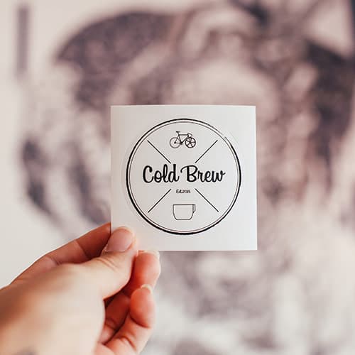
Your logo is inseparably linked to your company. Colour, design, font - the combination must be right. It must work both online and offline. The design should therefore be well chosen, after all it represents you and your employees. There is already a large selection of free tools online. With these you can build a logo for fun - without any knowledge of graphics. For a professional and creative piece of art, however, it is better to contact an agency or freelancer. -
Slogan
The slogan is similar. It should be short and snappy and get stuck in people's heads. Countless examples show how well this works. Your hear "Eat fresh" - and a familiar world opens up. You need a slogan that gets to the heart of your principles and thus picks up on your corporate identity.
Find a color concept
Colours have a great subconscious influence on us - they even excite us. Therefore, think carefully about how your colour scheme should be structured. What suits your product and what should it express? Some companies have been able to implement this so well that certain colours are directly associated with their brand. The power of colours should therefore not be underestimated. They can express emotions and influence our behaviour. Each colour has a direct psychological and physical effect on us. You decide which effect is to be unfolded.
It is important to remember that green is not just green. Colour models and colour catalogues such as RGB, CMYK, hex value or Pantone are used to define the exact tone.
For example, WhatsApp green has the hex value #64D448 or RGB (100,212,72). Online, there are colour generators that output the correct value for a selected colour. In this way, you can be sure that you have always struck the right note in your own corporate design.
Existing colour names such as Olive Green, Mint or Turquoise Green can already inspire you. Sites such as colordrop show matching colour families, so that in addition to the primary colour, a matching secondary colour can easily be found. This can either be of a similar nature (e.g. green+blue) or used as a complementary colour for strong accents (e.g. green+red).
Visual design
-
Font styles
Nowadays you can choose from countless fonts. Which one is the right one? You will find the answer in your product. If you run a small cupcake shop, a fine, ornate and playful font would be suitable. Transferring this concept to a steakhouse, on the other hand, would not be advisable. You can find various free fonts online in creative, fancy but also classic styles. -
Working clothes
Do you want your team to wear a certain uniform/work clothes? This would be advisable to guarantee a central theme in your CP. The logo can also be used. Uniformity also ensures that customers perceive you directly. It also creates a "we-feeling" among the staff, which can have a positive effect on the working atmosphere. Personal fashion references are left out of the equation so that employees can concentrate fully on their work. Tip: Look for fair trade clothing made of organic cotton. -
The appearance of your restaurant/food truck
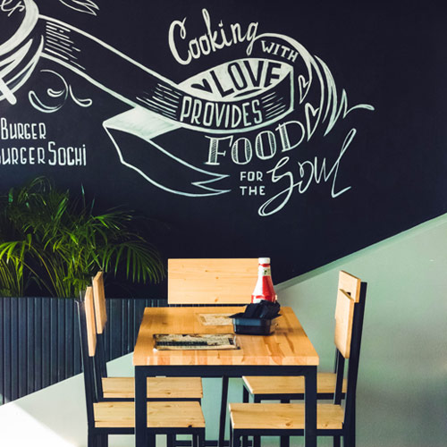
How do you want to appear to the outside world? What should be the first impression when customers enter the shop? These are the central questions when considering the interior design of a restaurant. Should it be more modern and urban? Or cosy and rustic? Concentrate on your product and how you can best make it the centre of attention. This starts with the lighting and ends with the wall decoration. The logo's colour concept must be recognisable as a guiding principle. Eye-catchers, such as pictures or photos, ensure a recognisable value.
Have articles printed with your corporate design
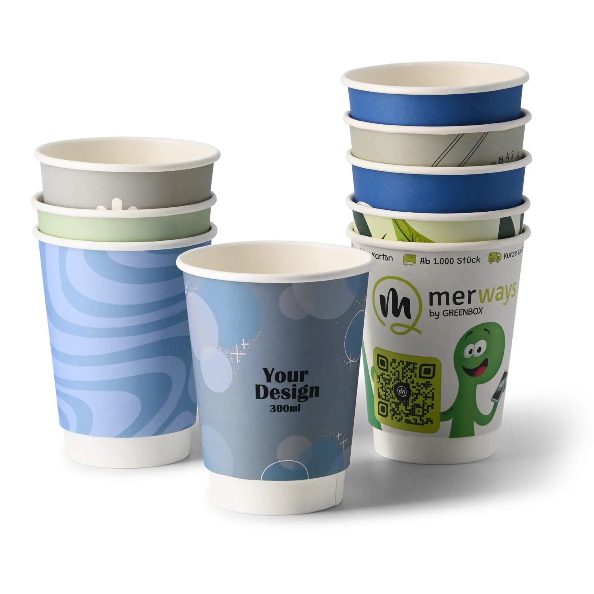
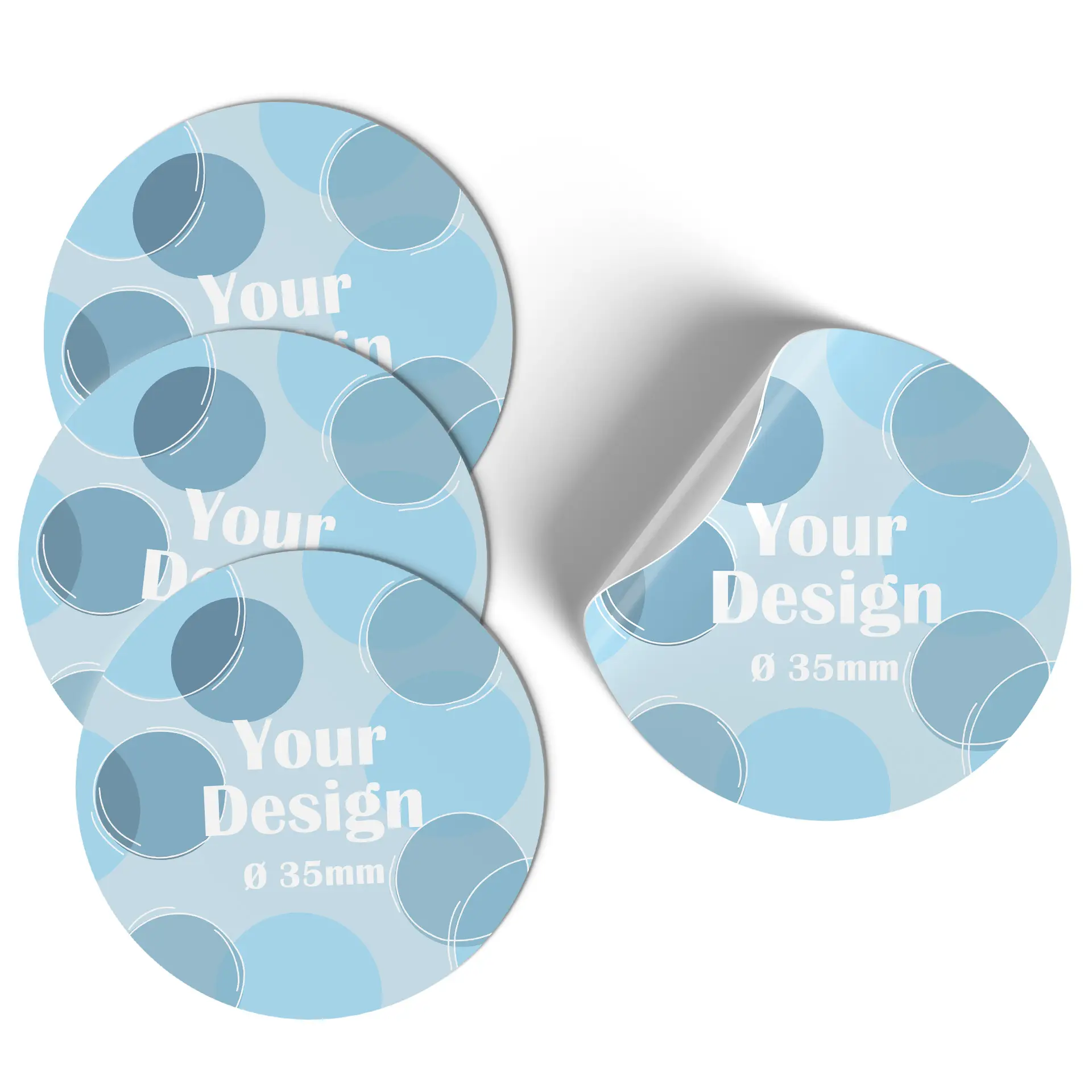
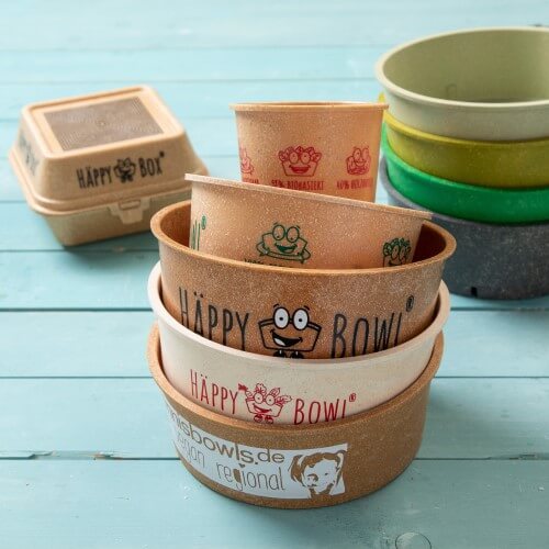
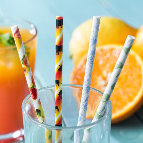
A lot of money and work goes into your finished logo. It would be a shame to just print it on menus or paint it on your food truck. If you sell your food and drinks to-go or take-away, have the logo printed on paper cups, carrier bags and the like. Your customers will walk through the city as an active advertising board and will promote you free of charge. Potential new customers will thus become aware of you - especially if your logo is an eye-catcher. We can take on this task for you by printing your labels, paper cups or carrier bags. If you run a café or restaurant, the items there should also have your stamp on them. This ensures individualisation, uniformity and a calm overall image. We can help you with this by printing your drinking straws and biodegradable napkins as well. Food pictures of the meal or cocktail are popular motifs on Instagram and TikTok. If your logo can be seen on the photo, you can again look forward to free advertising.

What do you want to achieve?
The whole effort should of course be worthwhile - and it will be. With your corporate design you stand out from competitors in your field. If you have a particularly eye-catching CD - all the better! The more attention you attract, the more people will remember you. In addition, the perfect interplay of design and identity is a sign of professionalism and authenticity. Customers appreciate this and are therefore happy to be your guests. If you are unique and one-of-a-kind, you will be great in the long run!

Sign up for our Green Box newsletter for more information, helpful tips or exciting product news. Get an additional €5 discount¹ on your next order.
¹Redeemable from a purchase value of €50 and only once as a newsletter subscriber:in. All data will be treated confidentially. Unsubscription is possible at any time
- ✔ Exclusive offers for subscribers
- ✔ Exciting news
- ✔ Helpful tips
- ✔ New products

Would you like to read more such articles, or do you have a critical comment on the content? Then please send us an email with a reference to the specific article to feedback@greenbox.bio. This way we can continue to provide you with interesting content.


